
|
For this assignment, I had to vectorize, and make variations the logos that I chose. I changed the color, thickness, and added hearts to some of the logo designs that I had. The most frustrating part of the process was when I had to think of ways to change/make variations of my original 3 logos. I realized that I couldn't really make many variables without just changing the color, so I decided to vectorize another logo (the block letters). This helped me make sure that I was able to make variations of my original logos without only changing the color. My favorite thing about this process was making the different variations because I could experiment with which colors/thickness I wanted. Something I learned from the whole experience is that making something too simple can make it hard to change. Because my original 3 logos were all too simple, I had a bit of trouble making variations. 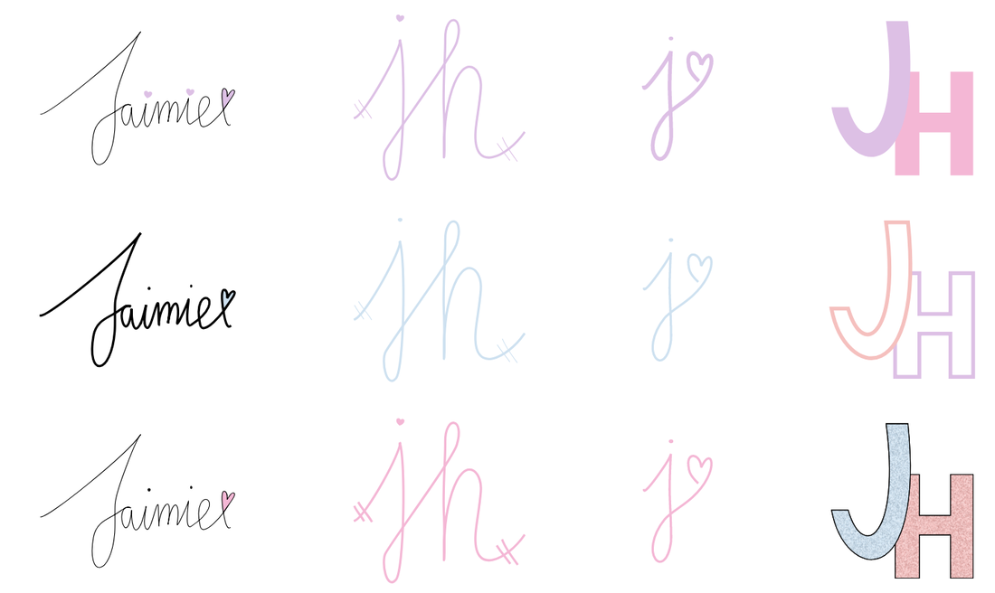 I just based my logo on myself. In my opinion, I like simple things, so I decided to use my initials. My logo represents me because I use my initials, and my first name. I also used blue, because I like the color blue. From the different variations I made, I picked this one because it was using my full first name. This one is also simple, but not too simple, and it made it look casual. During the creation process, I had to make sure that my name looked like my handwriting, so it took a lot of modifying to make sure that my final logo looked like my actual handwriting. 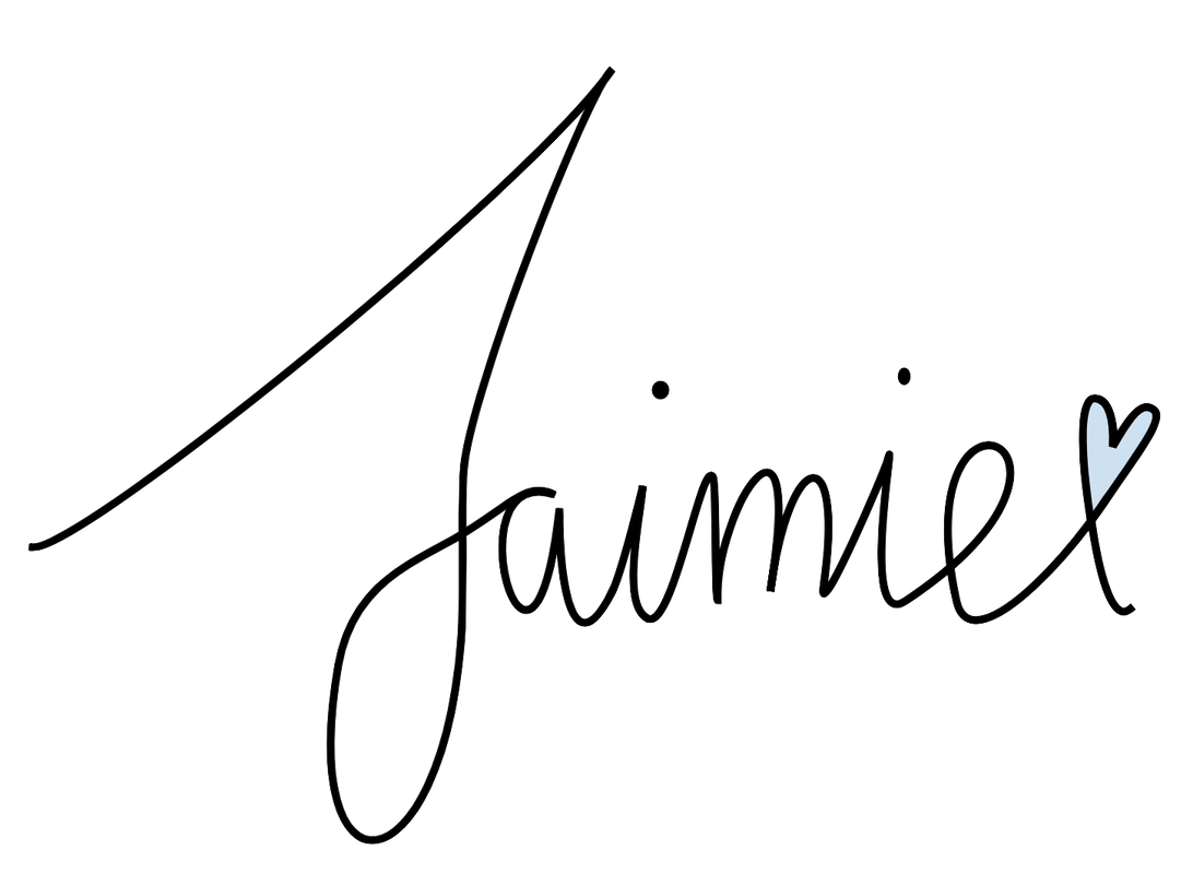
0 Comments
Leave a Reply. |
Archives
May 2019
Categories
All
 This work is licensed under a Creative Commons Attribution-NonCommercial-NoDerivatives 4.0 International License. |
