
|
For this assignment, I had to vectorize, and make variations the logos that I chose. I changed the color, thickness, and added hearts to some of the logo designs that I had. The most frustrating part of the process was when I had to think of ways to change/make variations of my original 3 logos. I realized that I couldn't really make many variables without just changing the color, so I decided to vectorize another logo (the block letters). This helped me make sure that I was able to make variations of my original logos without only changing the color. My favorite thing about this process was making the different variations because I could experiment with which colors/thickness I wanted. Something I learned from the whole experience is that making something too simple can make it hard to change. Because my original 3 logos were all too simple, I had a bit of trouble making variations. 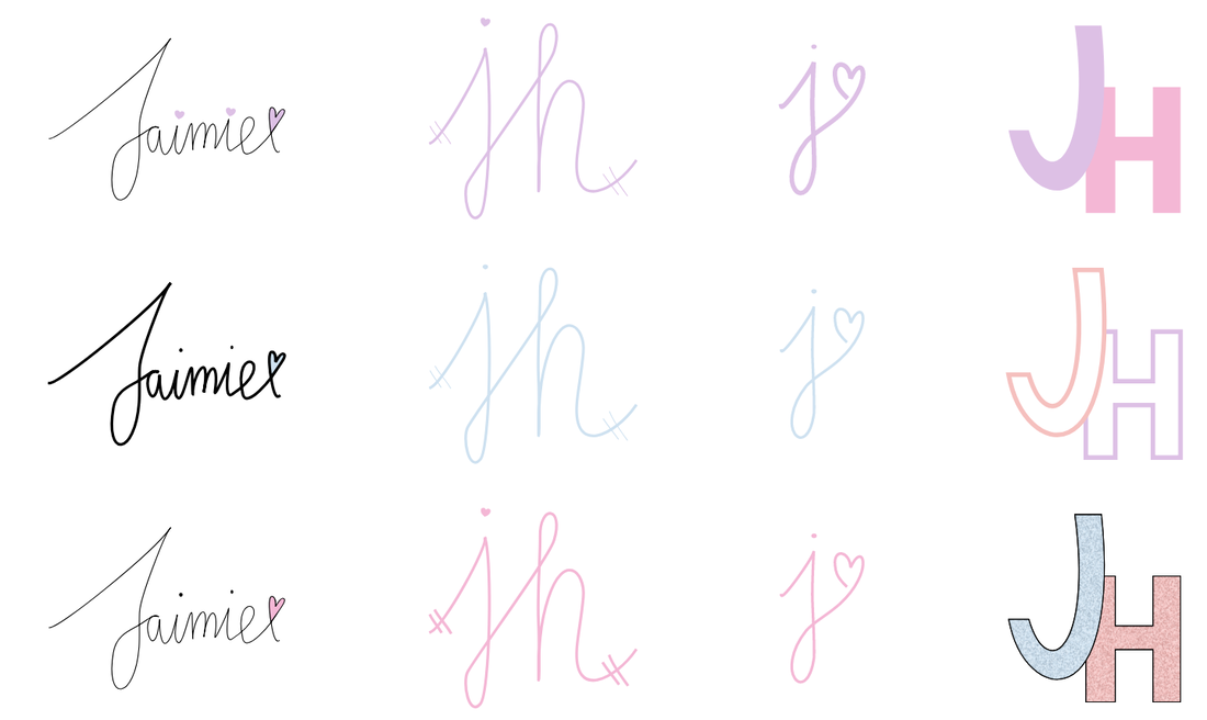 I just based my logo on myself. In my opinion, I like simple things, so I decided to use my initials. My logo represents me because I use my initials, and my first name. I also used blue, because I like the color blue. From the different variations I made, I picked this one because it was using my full first name. This one is also simple, but not too simple, and it made it look casual. During the creation process, I had to make sure that my name looked like my handwriting, so it took a lot of modifying to make sure that my final logo looked like my actual handwriting. 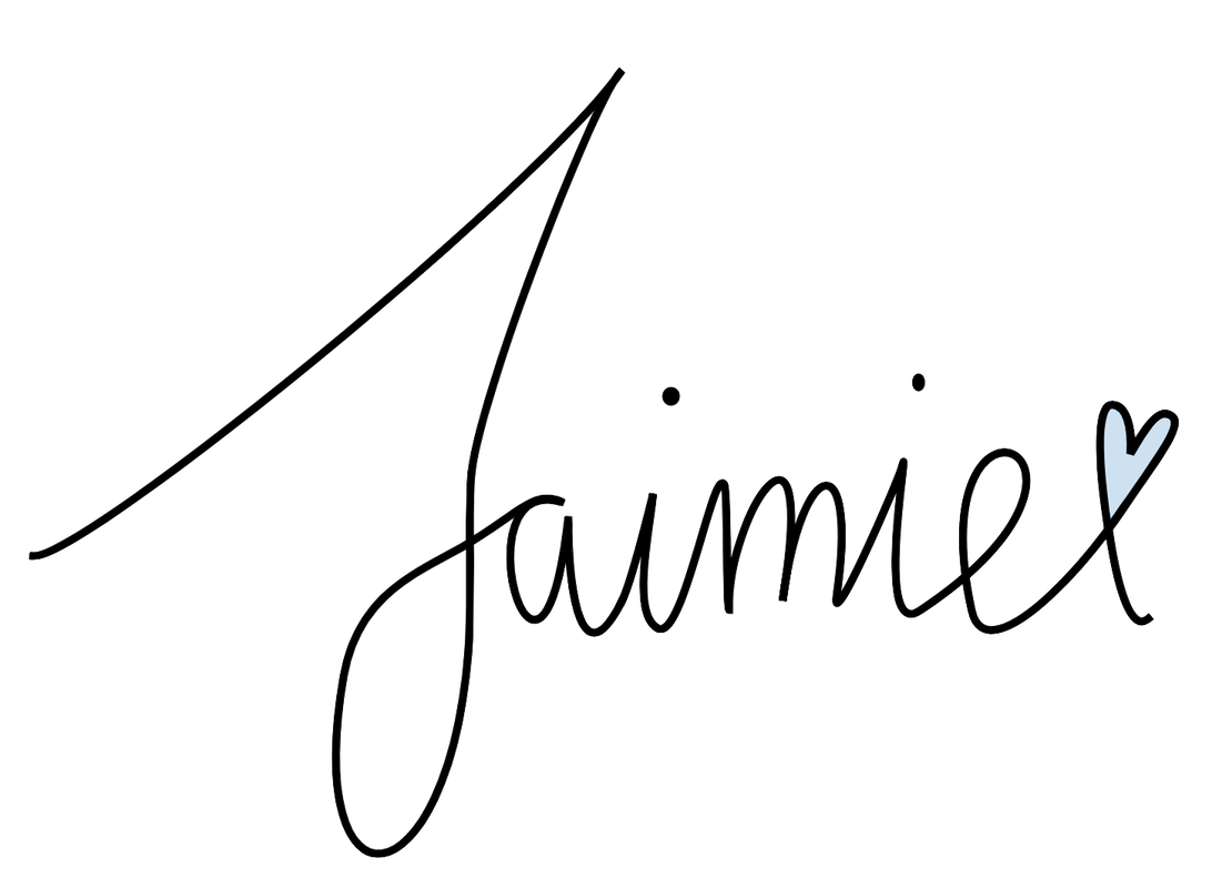
0 Comments
The three logos that I chose were the ones that I thought were simple, but not too simple. My 3 logos represent my name/initials. I didn't really have anything that I felt really strongly about to make a logo out of, so I just decided to make my logo using my name/initials. My favoritie one is the one with my full first name, and a heart at the end because I think it's very simple, and easy to look at. I don't really like the one in the circles, because I think it was too not my style. The process of making my logos weren't hard, but I think it was a bit frustrating for me. It's kind of hard for me to think of new things, so when it came down to actually making the logos, I think it was not too easy for me. The easiest part of this was to choose which 3 logos I wanted to use, since I could tell by just looking at the logos which ones I wanted to use. 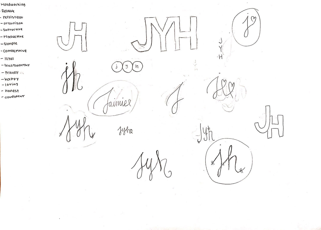 In this assignment, I had to use the four color schemes and show examples of each color scheme. For this assignment, I used the website Adobe Color to get my color combinations for each of the four color schemes. The four color schemes that we learned about in class are; complementary, triad, monochromatic, and analogous. A complementary color scheme is when you merge hues from opposite sides of the color wheel. A triad color scheme is when you combine 3 hues from the color wheel, but the hues have to be evenly spaced throughout the wheel. A monochromatic color scheme is when you combine use one hue, but you change the saturation, and brightness levels. An analogous color scheme is when you choose hues that are next to each other on the color wheel, but they are spaced out evenly. My favorite color scheme is the analogous color scheme, because it is very aesthetic. Since complementary color schemes and triad color schemes are too spread apart from one another in the color wheel, the hues sometimes do not go well with each other. However, an analogous color scheme generally makes sure that the hues go along well. Overall, this assignment wasn't that hard for me. I used the "shapes" tool and the "pen" tool to make my planet, which I then changed into different colors according to the color scheme. 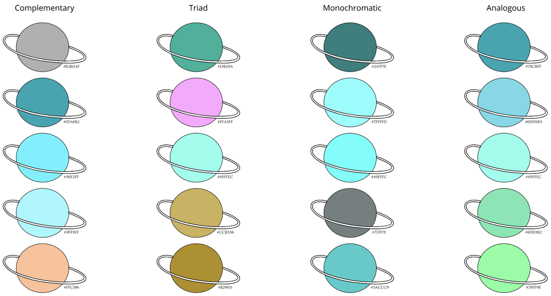 For this summative, we got different colors and we had to find out the hex code and the RGB code of that color. Some challenges I faced were when I had a hard time trying to align everything to each other, so that everything would be straight. To overcome this challenge, I just restarted, so that I could see what went wrong from the beginning. Some successes were when I was able to choose the colors, and find the hex code/RGB code for all of the colors without trouble. Something that I'm proud of in this artwork is how I made the colors go from a darker shade to a lighter shade. To do this, I used the pen tool, and the shapes. so that It would be aesthetically pleasing to look at. There wasn't really an inspiration to my artwork, as I just chose to do a whale because whales look good with any color. 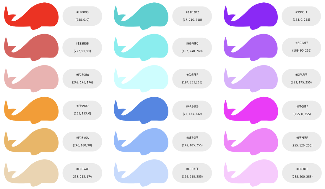 The definition of typography is the technique used to deliver a meaning. You can do this with different fonts, color, and sizes. For example, if you wanted something to seem important, you would write it in a font that conveys a similar meaning. The quote "Each font has a personality and a purpose." means that a font can express different things better than another font. For example, you wouldn't write something happy in a font that seems like the writing is written in blood. There are five types of fonts that we learned about, such as serif, sans serif, monospace, novelty, and script. A serif font would be used when writing something formal, like a letter or a collage application. A sans serif font is less formal than a serif font. You could use it when you are writing something like a story. A monospace font is usually used in coding. A novelty font is a font that is playful. You could use a novelty font to accent some parts of your writing. The last type of of font we learned about is a script font. It is very fancy, and you would probably use it the same way you would use a novelty font. Typeface ComparisonFor this activity, we used our knowledge of the different types of fonts to compare the different types of fonts. We used the same text as an example, and I used, "This is a font." We had to align and space all the words carefully, so that it looked pleasing. I made sure that all the names of the fonts were the same size, and font, while I also made the type of font the same size and font with each other. I learned to distinguish the differences between the different type of fonts. 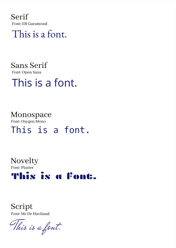 Word PortraitsIn this activity, we had to use 10 different fonts to show that every font has a meaning. I made sure the names of the fonts were all the same size, and that the words were aligned with each other, so that it looked eye-pleasing. I learned to be able to see how a font can show different meaning depending on the shape of the font. I used fonts such as Bahiana, Biegelow Rules, Butcherman, etc. 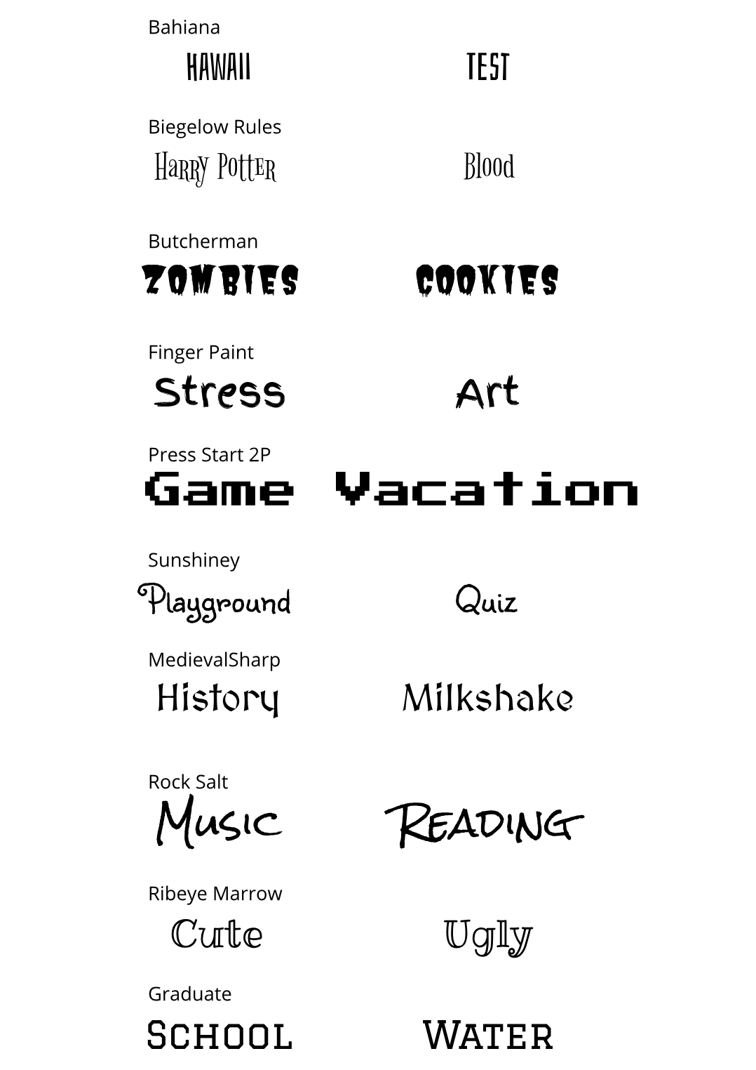 |
Archives
May 2019
Categories
All
 This work is licensed under a Creative Commons Attribution-NonCommercial-NoDerivatives 4.0 International License. |
